VueForm Laravel Backend — Examples
This file collects focused examples (no installation instructions) drawn from the example builders in app/VueForm/*.
Files referenced:
- app/VueForm/Fields/TextElementForm.php
https://github.com/bijoy4067/vueform-laravel-backend/blob/main/app/VueForm/Fields/TextElementForm.php - app/VueForm/Fields/TagsElementForm.php
https://github.com/bijoy4067/vueform-laravel-backend/blob/main/app/VueForm/Fields/TagsElementForm.php - app/VueForm/Fields/PhoneElementForm.php
https://github.com/bijoy4067/vueform-laravel-backend/blob/main/app/VueForm/Fields/PhoneElementForm.php - app/VueForm/Structure/GroupElementForm.php
https://github.com/bijoy4067/vueform-laravel-backend/blob/main/app/VueForm/Structure/GroupElementForm.php - app/VueForm/Structure/ListElementForm.php
https://github.com/bijoy4067/vueform-laravel-backend/blob/main/app/VueForm/Structure/ListElementForm.php - app/VueForm/Static/StaticElementForm.php
https://github.com/bijoy4067/vueform-laravel-backend/blob/main/app/VueForm/Static/StaticElementForm.php - app/VueForm/Static/ButtonElementForm.php
https://github.com/bijoy4067/vueform-laravel-backend/blob/main/app/VueForm/Static/ButtonElementForm.php
Text input example
Demonstrates text, number, email, password and url fields, defaults, conditional visibility and an addon slot.
Key excerpt:
Vueform::name('text-element-form')
    ->default([
        'search' => 'Search',
        'number' => '123456',
        'email' => 'user@example.com',
        'password' => 'password123',
        'url' => 'https://example.com',
    ])
    ->schema([
        TextElement::name('search')->info(null),
        TextElement::name('addon')->slots([
            'addon-before' => '<i class="fa fa-search"></i>'
        ]),
        TextElement::name('number')
            ->inputType('number')
            ->conditions([ ['search', 'not_empty'] ]),
        TextElement::name('email')->inputType('email'),
        TextElement::name('password')->inputType('password'),
        TextElement::name('url')->inputType('url'),
        ButtonElement::submitButton()
    ]);
Example form handler (validation + JSON response):
public static function formData($request)
{
    $request->validate([
        'search' => 'required'
    ]);

    return response()->json(['status' => 'success']);
}
Tags (multi-select) example
Shows tags with custom slots, static items or remote items, limits and events.
Key excerpt:
TagsElement::name('category')
    ->type('tags')
    ->closeOnSelect(false)
    ->search(true)
    ->label('Categoryxx')
    ->inputType('search')
    ->limit(5)
    ->rules('required')
    ->items([
        ['value' => 1, 'label' => 'Category 1', 'color' => 'red', 'name' => 'foo'],
        ['value' => 2, 'label' => 'Category 2', 'color' => 'red', 'name' => 'foo'],
        ['value' => 3, 'label' => 'Category 3', 'color' => 'red', 'name' => 'foo']
    ])
    ->slots([
        'tag' => '<span class="badge w-auto" style="background-color: {{ option.color}}; ...">{{ option.label }}</span>',
        'info' => '<span>gggg ddd ddd</span>',
        'before' => '<h1 style="color: blue;"> Please select categories cc</h1>',
    ]),
Remote items example:
TagsElement::name('tags')
    ->items('http://localhost:8000/tags/json')
    ->max(5);
Group & List structure examples
Arrange fields into rows/columns and create repeatable list items.
Group example (row with columns, conditional show):
GroupElement::rowWith4Columns([
    TextElement::name('first_name'),
    TagsElement::name('category')->conditions([['first_name','not_empty']]),
    TextElement::name('search'),
    TextElement::name('number')->inputType('number'),
]),
List (repeatable schema) example:
ListElement::schema([
    TextElement::name('item_name')->label('Item Name')->rules('required'),
    GroupElement::rowWith4Columns([
        GroupElement::rowWith4Columns([
            TextElement::name('first_name'),
            TextElement::name('first_name_old')
        ]),
    ]),
])
Phone element example
Phone input with country include and unmask option:
PhoneElement::name('phone')
    ->include(['bd'])
    ->unmask(true)
Static elements & submit button
Static content helpers (text, headers, hr, image) and a submit button helper.
Static elements:
StaticElement::text('asdf'),
StaticElement::h1('asdf'),
StaticElement::hr(),
StaticElement::img(src: 'https://vueform.com/images/logo.svg', height: 40, width: 570)
Submit button:
ButtonElement::submitButton()
Minimal usage notes
- Each example builder returns a configured Vueform instance inside buildForm().
- Many examples include a static formData($request) method to validate request input and return JSON — place your submission logic there.
- Use conditions() to show/hide elements based on other field values, and items() for static or remote options.
Event Handling
VueForm allows you to attach JavaScript event handlers to form elements and trigger custom logic on the frontend.
Step 1 — Attach Event to Element
Inside your form class, define an event using the ->event() method.
For example, attaching a click event to a Submit button:
protected function buildForm()
{
    return Vueform::build()
        ->schema([
            ButtonElement::submitButton()
                ->event([
                    'click' => 'handleSubmit'
                ]),
        ]);
}
Here, the event key click represents the DOM event, and the value handleSubmit is the JavaScript function name that will be executed.
Step 2 — Define the JavaScript Handler
Next, define the handleSubmit function in:
public/vueform-laravel/vueform-custom.jsExample handler:
function handleSubmit() {
    alert("Submit button clicked!");
}
Done!
After completing both steps, your VueForm buttons will be able to trigger custom JavaScript logic without additional configuration.
Slots
VueForm allows you to customize the appearance and behavior of form elements using slots. Slots are placeholders inside an element template that can be filled with custom HTML.
Step 1 — Attach Slots to Element
Inside your form class, define slots using the ->slots() method.
For example, update the design for a TagsElement tag slot:
protected function buildForm()
{
return Vueform::build()
->schema([
TagsElement::name('user')
->type('tags')
->items([
['value' => 'user1', 'label' => 'Bijoy karmokar', 'image' => 'http://127.0.0.1:8000/assets/images/user-1.jpg'],
['value' => 'user2', 'label' => 'User Two', 'image' => 'http://127.0.0.1:8000/assets/images/user-2.jpg'],
['value' => 'user3', 'label' => 'User Three', 'image' => 'http://127.0.0.1:8000/assets/images/user-2.jpg']
])
->slots([
'tag' => '
 {{option . label }}
',
'info' => 'Select Category',
'before' => '
{{option . label }}
',
'info' => 'Select Category',
'before' => ' Please select categories
',
]),
]);
}Each element provides its own set of slots. A slot represents a template block inside that element. By supplying custom HTML to a slot, you can override and redesign that specific block. This allows you to fully control the HTML and visual structure of the element without modifying the component itself.
Example Output
Below is how the customized tag slot would render visually:
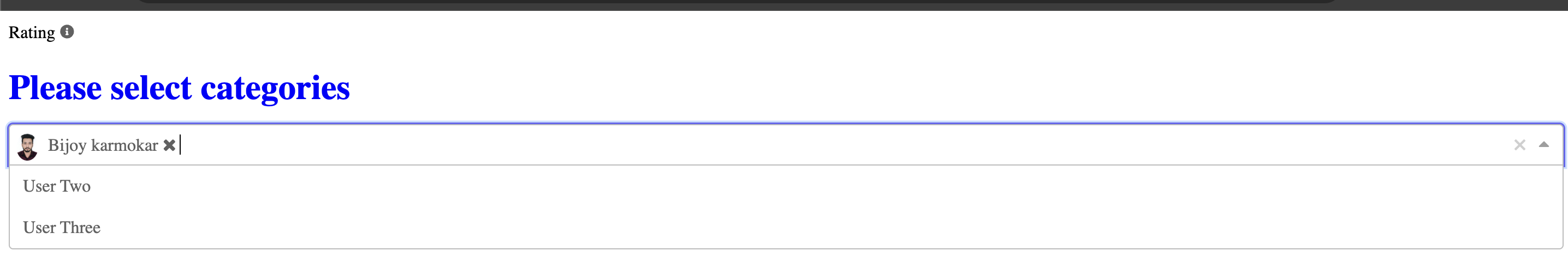
Done!
After applying custom slots, VueForm will automatically use your HTML templates during rendering.